Musicians and mortality
For those who prefer video, this case study is described in the April 19th lecture of our Spring 2017 course.
Prologue
If we desire an improved public understanding of science, we researchers have to do our part to communicate beyond the narrow academic audiences to which our scholarly work is targeted. We would love to see more scholars share their findings with the general public by writing popular articles, speaking in public forums, addressing audiences on radio and television, and presenting their work in accessible fashion on the web. In this case study we look at how Professor Dianna Kenny's laudable effort at publicly disseminating her scholarly work took on a life of its own as her words and data were reinterpreted and re-explained. We concede that public communication can at times be a thankless task: appearing on a site entitled "Calling Bullshit" is hardly an adequate reward for investing one's time in outreach activities. But we feel that this type of outreach is essential, and to improve our collective skills we need to study what kinds of things can go wrong downstream.
Age of death by genre
In March 2015, a striking graph made the rounds on social media. The graph, reproduced below, appears to show that being a musician in older musical genres — blues, jazz, gospel — is a relatively safe occupation, whereas performing new genres — punk, metal, and especially rap and hip-hop — is extraordinarily dangerous.
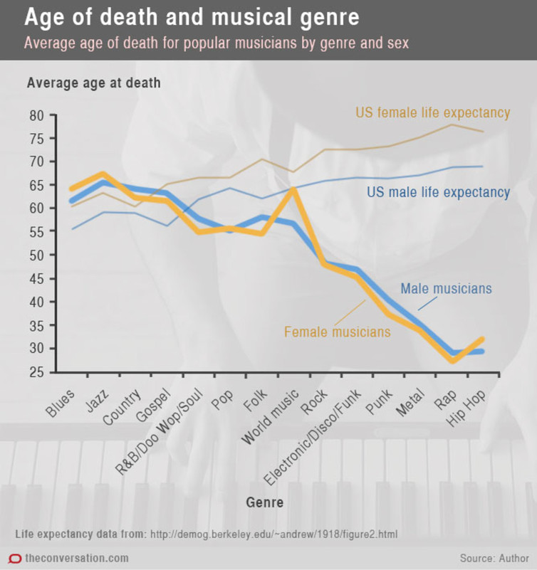
This graph derived from an article entitled Music to die for: how genre affects popular musicians' life expectancy on a scholarly news website called The Conversation (tagline: Academic Rigor, Journalistic Flair). As a piece of data visualization, it made for a great social media meme. Not only do we have hard quantitative data about an interesting topic, but these data reinforce anecdotal impressions that many of us may already hold about the dangers of performing popular music and the hard living that often goes with it. The graph and accompanying article even spurred a credulous post on the Washington Post's WonkBlog, which proclaimed that:
[Study author Dianna Kenny] found that musicians from older genres – including blues, jazz, country and gospel – have similar lifespans to American people their own age. The life expectancy for R&B musicians is slightly lower, while the life expectancy for newer genres like rock, techno, punk, metal, rap and hip hop is significantly shorter."
A regular news story in the Washington Post goes even further, quoting author Dianna Kenny as follows:
"It's a cautionary tale to some degree," Kenny told the Washington Post. "People who go into rap music or hip hop or punk, they're in a much more occupational hazard profession compared to war. We don't lose half our army in a battle."More dangerous than war — that's a strong claim.
Right censoring
Looking at the graph for a moment, however, it's pretty clear that something isn't right. It's not just that the author has used a line graph for categorical data. Nor is the fact that the visual effect is exaggerated because the vertical axis has been truncated at 25. (This is in fact the right thing to do for many line graphs, but that's a separate story ). What aroused my suspicion was the implausibly large difference in ages at death. I wouldn't be particularly skeptical if the study found 5-10% declines for musicians in some genres and only a bit concerned if they reported 25% declines. But look at the graph. Rap and hip-hop musicians purportedly die at about 30 years of age — half that of most other genres.
So what's going on? It's actually pretty straightforward. While none of the original data were available at the time of publication, it's not hard to see that the data must be right-censored. Most rap and hip-hop stars are still alive today; we don't know how long they'll live. Moreover, rap and hip-hop are new genres, not yet 40 years old, and very few popular musicians begin their careers in their forties rather than their teens or twenties. So the only rap and hip-hop musicians who have died already are those who have died prematurely. Not so with jazz, blues, country, gospel, etc. These genres have been around for a century or more and in these areas we have plenty of performers who lived a full life.
In other words, it's not that rap stars will likely die young; it's that the rap stars who have died certainly died young because rap hasn't been around long enough for it to be otherwise.
The graph provides a couple of other clues that we are dealing with right-censoring. The first is that mortality rates closely track the age of genre. Rock is bad, disco worse, punk worse still, then metal, then rap and hip-hop. Now maybe music is evolving into riskier and riskier lifestyles, but somehow that seems implausible. Second, the lines plotting life expectancy by cohort increase as we move from blues and jazz to rock and hip-hop. This confirms that the cohorts are in fact different, and that the latter cohorts are substantially younger.
Where things went wrong
If one traces back from the data graphic to the actual article in which it appeared, it becomes clear that the author was aware of the issues discussed above and accounted for it in her scholarly study. In the popular The Conversation article, she writes
"This pattern reflects, to some extent, a confound in the data: musicians who are dying youngest belong to newer genres (electronic, punk, metal, rap, hip-hop) that have not existed as long as genres such as jazz, country, gospel and blues. Consequently, they have not had the same opportunity to live a full lifespan."
This is a pretty straightforward acknowledgment of right-censoring in the data. Unfortunately, no such caveat appears in the data graphic and few readers will have the statistical training necessary to see it. That is a problem. I had not realized this previously either, but in a social media environment we have to be prepared for our data graphics — at least those from popular pieces — to be spread without the accompanying text. This is quite different from how we design data graphics for scholarly papers. There the risk of a figure "going viral" is lower; one can more freely omit mention of issues and caveats that are solidly addressed in the main text or figure caption. So in my view, the data in the Conversation article never should have plotted in the way that they were. While the figures are not incorrect, that graph tells a story that is not consistent with what the data would actually suggest if considered with care.
Some of the nuance is also lost as we go from the original Conversation article to the second-hand media reports about it. In the graph and original Conversation story, the vertical axis is correctly reported as average age at death. In the text from the Washington Post story that we quoted earlier, it has somehow been transformed into life expectancy — a very different measure. It is simply untrue that rap and hip-hop musicians have life expectancies below 30 years, even though the average age of death for deceased rap and hip-hop musicians in the study is indeed below 30 years.
The original story also provides a table, reproduced below, that lists causes of death by genre.
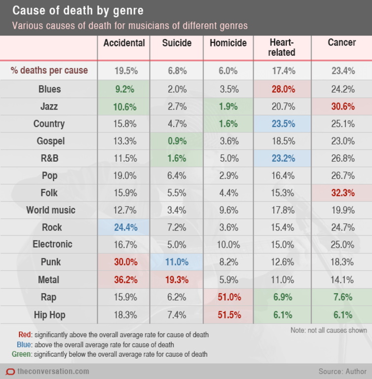
The table also has the potential to mislead to the casual reader, because it shows not the lifetime probability of each cause of death, but rather the probability of each cause of death conditional on death having already occurred at the time of the study. This is a very subtle issue to expect a popular audience to interpret correctly without lots of guidance. The comparisons between older genres and newer genres are not apples-to-apples comparisons. The main thing we see from the table is that performers from older genres are more likely to have died of diseases of old age, whereas performers from newer genres are more likely to have died from accident or violence. Unsurprising, given the age distributions.
Exacerbating the problem, the author refers to these percentages as rates: "The table below shows that musicians from different genres have different rates of death from different causes of death." But these are not rates, and the table actually does not show this at all. It is entirely possible that the age-specific rates of death could be the same for all genres, and all differences that appear in the table could derive from genre-specific differences in the age distribution.
In summary, the presentation in these articles is misleading because the pattern of genre-specific mortality that the author is trying to establish is confounded with the age distribution of musicians in each genre. Moreover, genre-specific differences in age distribution are likely to have a larger effect than underlying differences in genre-specific mortality among individuals of the same age. This confound is thoroughly treated in the scholarly paper, briefly discussed (but not corrected for) in the original Conversation article, hinted at in the Washington Post piece, and entirely unmentioned in the data graphics themselves.
Correlation and causality
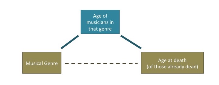
As a final note, we can view what is going on here in light of correlation and causality. To begin with, the study measures a correlation between musical genre and age at death, but untrained readers may interpret this as establishing causal connections. A bigger problem is that the correlation between musical genre and age at death appears to be in substantial part a consequence of correlations with another unmentioned variable. A main finding of the study is that we observe the following correlation:

However, much of this correlation arises as a consequence of two other correlations:
Coda
A year or so after the popular pieces in question were published, this research was presented in a scholarly article as well. In that paper, the authors explain the right-censoring issue and take reasonable steps to deal with it. While the statistics in the scholarly paper are not beyond reproach — note the huge number of uncorrected multiple comparisons — the data are strong enough that the basic patterns illustrated in the popular pieces appear to hold. It seems likely that musicians do suffer higher rates of mortality than the population at large, and I suspect it also is likely that causes of mortality indeed differ across musical genres.
The moral of this story, if there is one, is that the nuances of a study can be lost organically as a study is explained and interpreted and re-explained and reinterpreted, without any nefarious agenda or intent to deceive on anyone's part. Through a synergy of sloppy data graphics, careless reporting, excessive hype, muddled thinking, and uncritical use of social media, we end up with misleading meme that reaches orders of magnitude more people than the original scholarly research did. We see this as a serious problem and urge actors at every stage — from scholarly authors to data visualization experts to the people hitting "retweet" on twitter — to do their best to prevent this from happening.
Author's response
Author Dianna Kenny has graciously provided us with a response to our case study, explaining the situation from her perspective. Reading her view may be particularly useful for readers who share her admirable aim of explaining their work to the public. Professor Kenny writes:
While I applaud your intentions and agree that data misuse and misinterpretation are major issues, I was somewhat dismayed by your characterization of my study.
While you are correct in your technical facts with respect to the graphs presented in the Conversation pieces, I think you are overly focused on criticism and “demonstrating” that the conclusions drawn were not valid, although you acknowledge that they are indeed valid. The positive comments and general agreement with my findings are tucked away at the end of the piece and I (and possibly others) are left with the impression that popular musicians do not die younger and that different genres do not have different patterns in causes of death because many will not get to the end of the article to find out otherwise.
Of course, we were fully aware of the problems of right censoring – I had an actuary check all of my data analyses using actuarial methods to correct for this – and I tried to make this clear in The Conversation piece in layman’s language.
My original article contained the following statements:
This pattern reflects, to some extent, a confound in the data: musicians who are dying youngest belong to newer genres (electronic, punk, metal, rap, hip-hop) that have not existed as long as genres such as jazz, country, gospel and blues. Consequently, they have not had the same opportunity to live a full lifespan.
In the case of the newer genres, it’s worth pointing out that members of these genres have not yet lived long enough to fall into the highest-risk ages for heart- and liver-related illnesses. Consequently, they had the lowest rates of death in these categories.
I concluded with: "...tentative conclusions drawn from this series of studies.
One can only agree that it is difficult to prevent one's data and tentative opinions taking on a life of their own. This includes impugning findings that are valid, which is what I feel has occurred in your commentary on my study.
—Dianna Kenny